Telling stories with data
How the second largest newspaper in Slovenia turned a weekly infographics section into an international success.
By leading with example
Having a dedicated space to showcase what is possible has been invaluable in helping people recognize the potential of this medium.
By working as journalisrs
Working beyond design gave us increased sense of responsibility to the public, the subjects we covered, and the newsroom that stood behind us.
By establishing trust
Both readers and journalists are highly skeptical of newcomers, and building a following in media has not been a trivial process.
By being honest and transparent
Changing topics made it hard to develop expertise, so we kept an open dialog with expert colleagues and keen reades, on- and off-line.
By keeping it steady
The pace of media is relentless. We always tried to have a backup plan and kept the newsroom up-to-date, if something might not work out.
By proving real-life impact
Some of our work has directly influenced policy and government. The resulting recognition by our journalistic colleagues has been one to savour.
The whole story
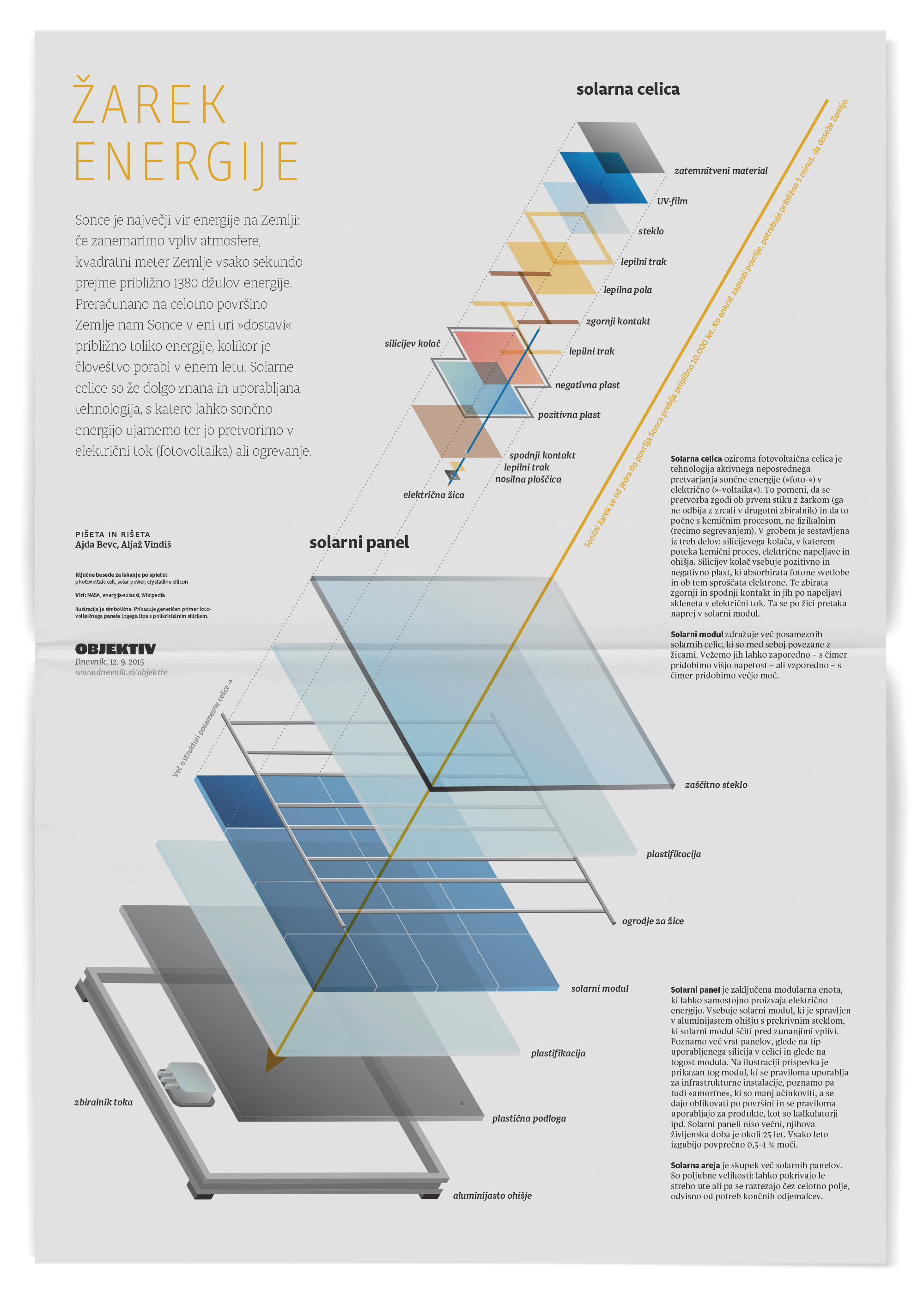
The first feature of two on solar power, detailing the structure of a typical solar power cell, and mechanics of how it functions. It's also featured on the cover of Malofiej 24 catalog.
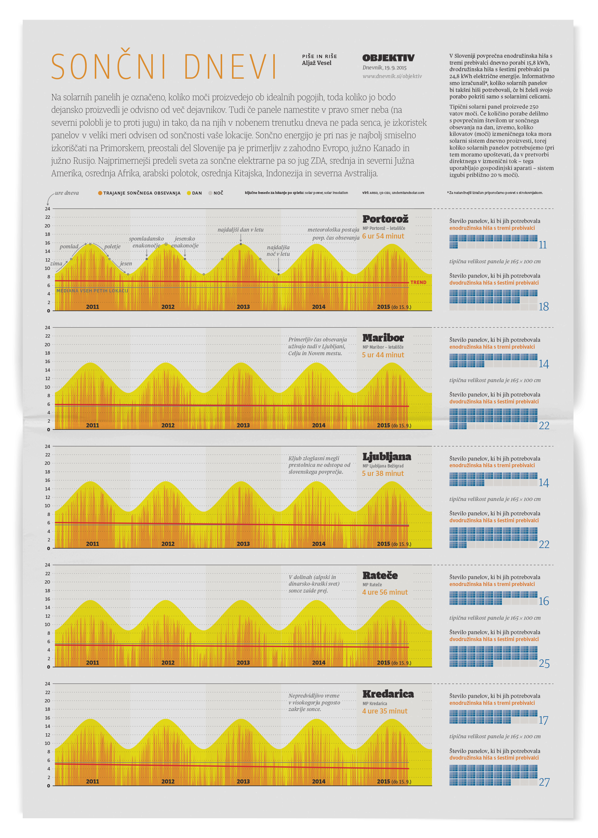
The second feature of the two. It presents the complex variables that make solar a worthwhile investment, or not (hint: it depends on location and orientation, by a lot).
Leap of faith
“So, are you up for it?” asked Samo Ačko. He was working as design director for Slovenia’s second-largest newspaper at the time. He just pitched taking over the entire last page of Dnevnik’s flagship weekly supplement, Objektiv (eng. “Lens”). On it, I would get to produce a full-page graphic feature. Each week that is. Samo set the whole thing up as a pilot for visual and data journalism, together with Miran Lesjak, the publication’s editor at the time. It was going to be named Objektivno (eng. “objective”). I always admired Samo’s ambition, having known him for a while, but this was far out even for him. “Yeah, let’s do this.”
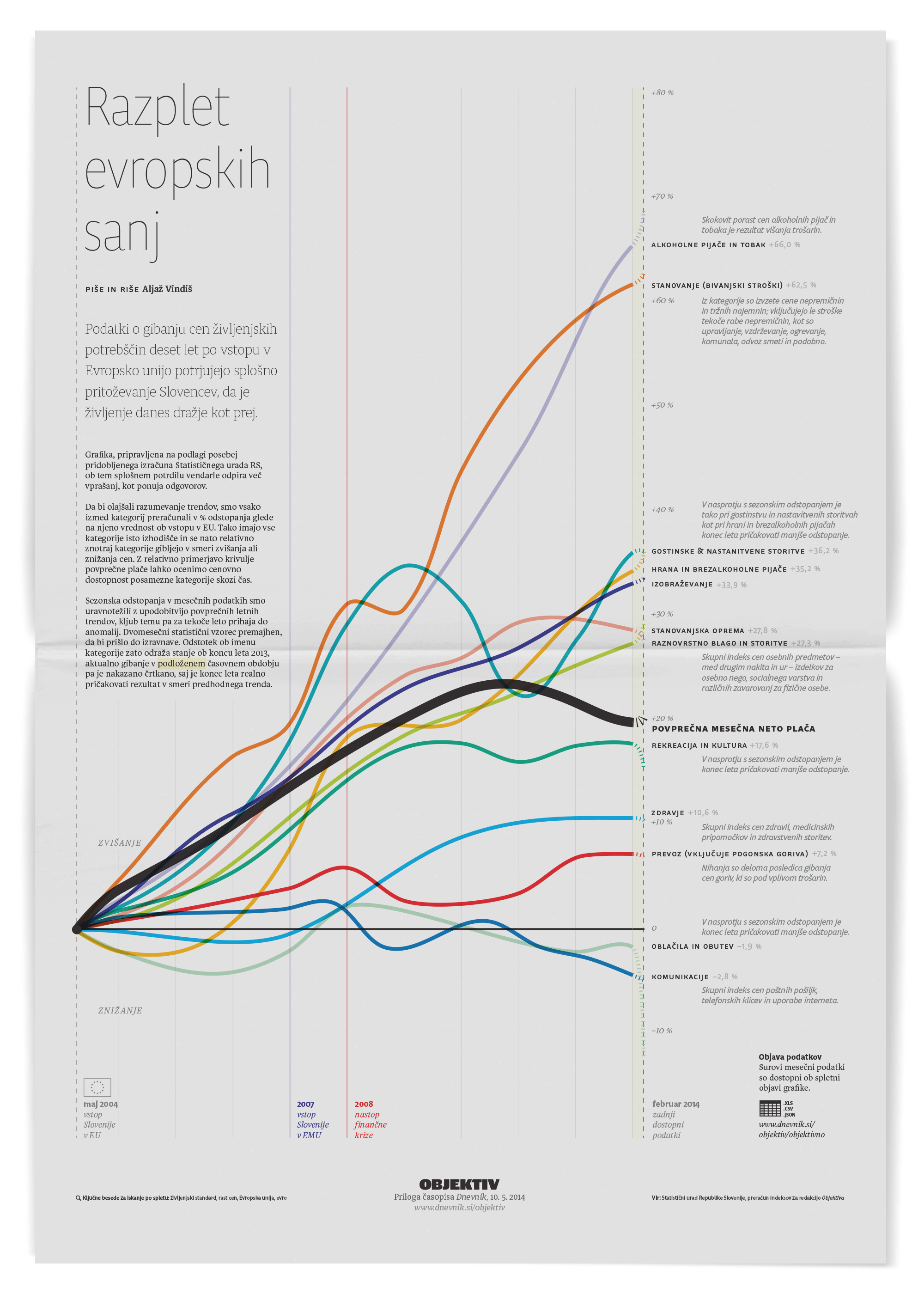
Exploring price swings in Slovenia after entering the EU and adopting the Euro currency.
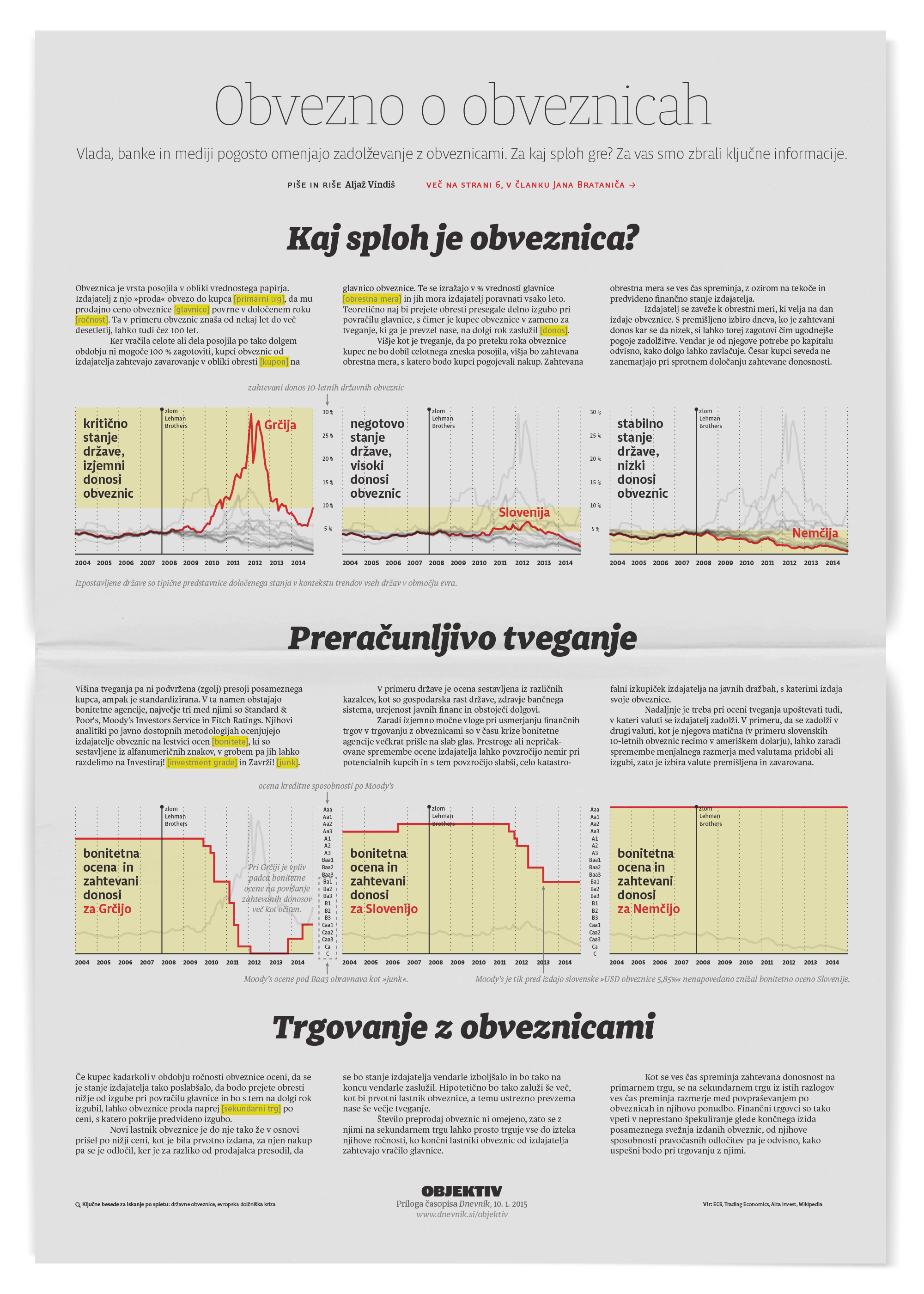
Plain language explanation of the EU bonds market, and Slovenian bonds' performance.
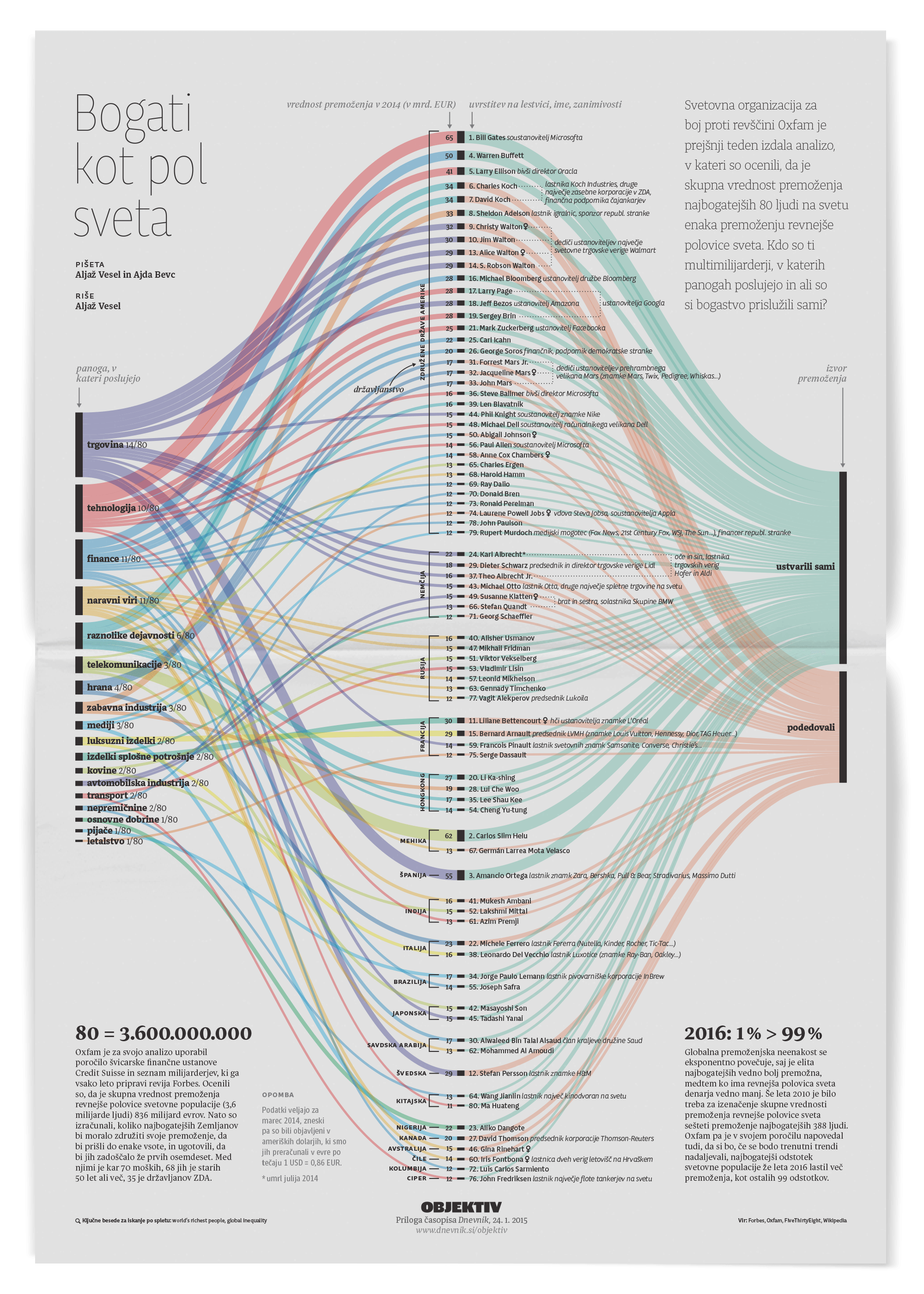
Sources of wealth for the richest people on Earth (it's half of the world's resources).
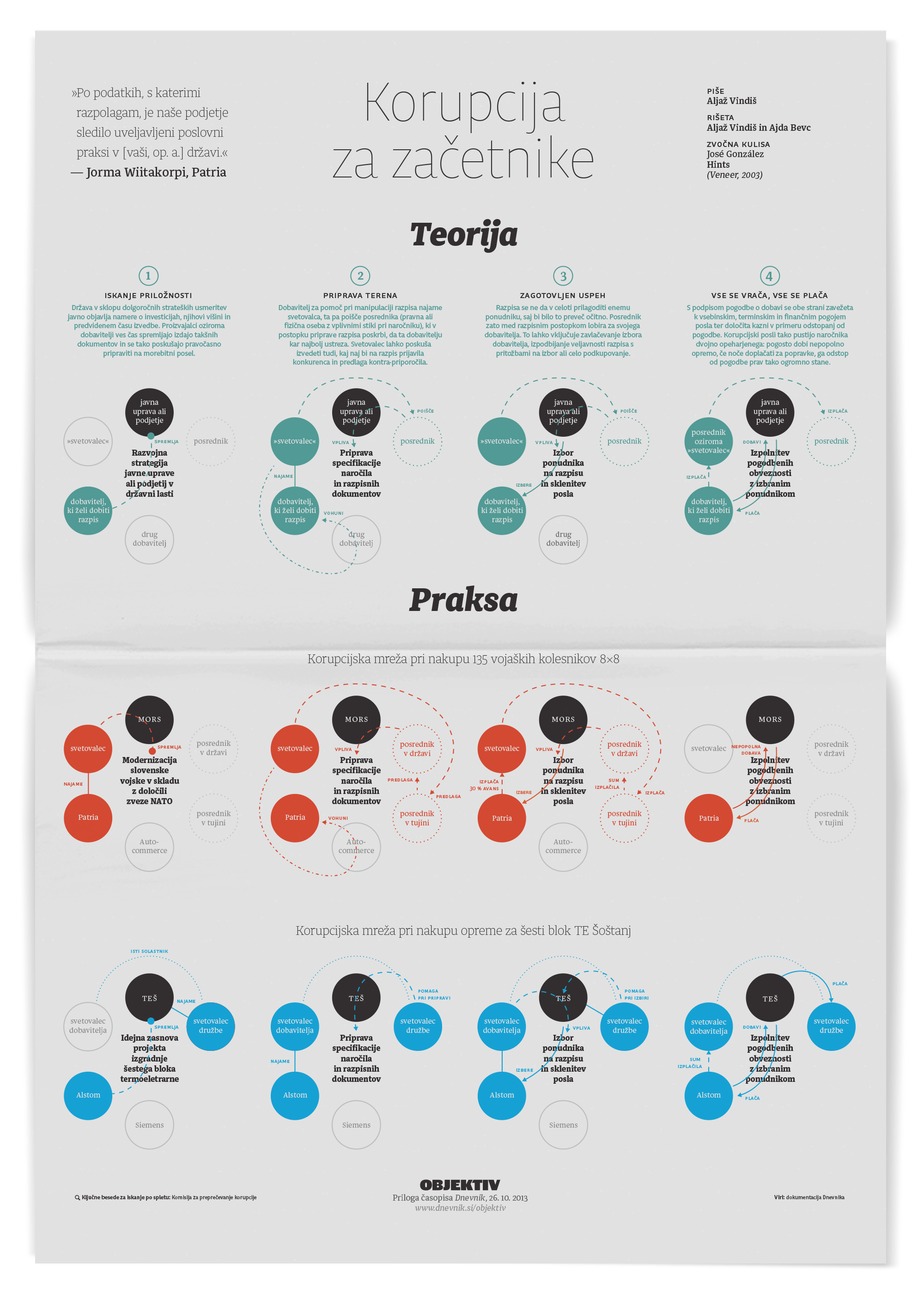
A template of corruptive acts behind two of the largest public orders in Slovenia.
At last I understand, how it all happened!
The toughest year (of my career)
If only I knew what I was getting myself into. As the author of the section, you had to deliver the whole thing: from research and synthesis to writing and drawing to laying it out and sending to print. Furthermore, a different topic had been chosen each week, in consultation with the editor and design director. Each Monday, a blank page was staring at you, and each Friday, the print deadline took its place. I scrambled. I faltered. And each mistake was seen by tens of thousands of people. That’s just in print; I am not even counting the website. I had to learn more in a year than ever before, or after. But it turned me, as it did my later desk-mates, from mere designers to actual journalists.
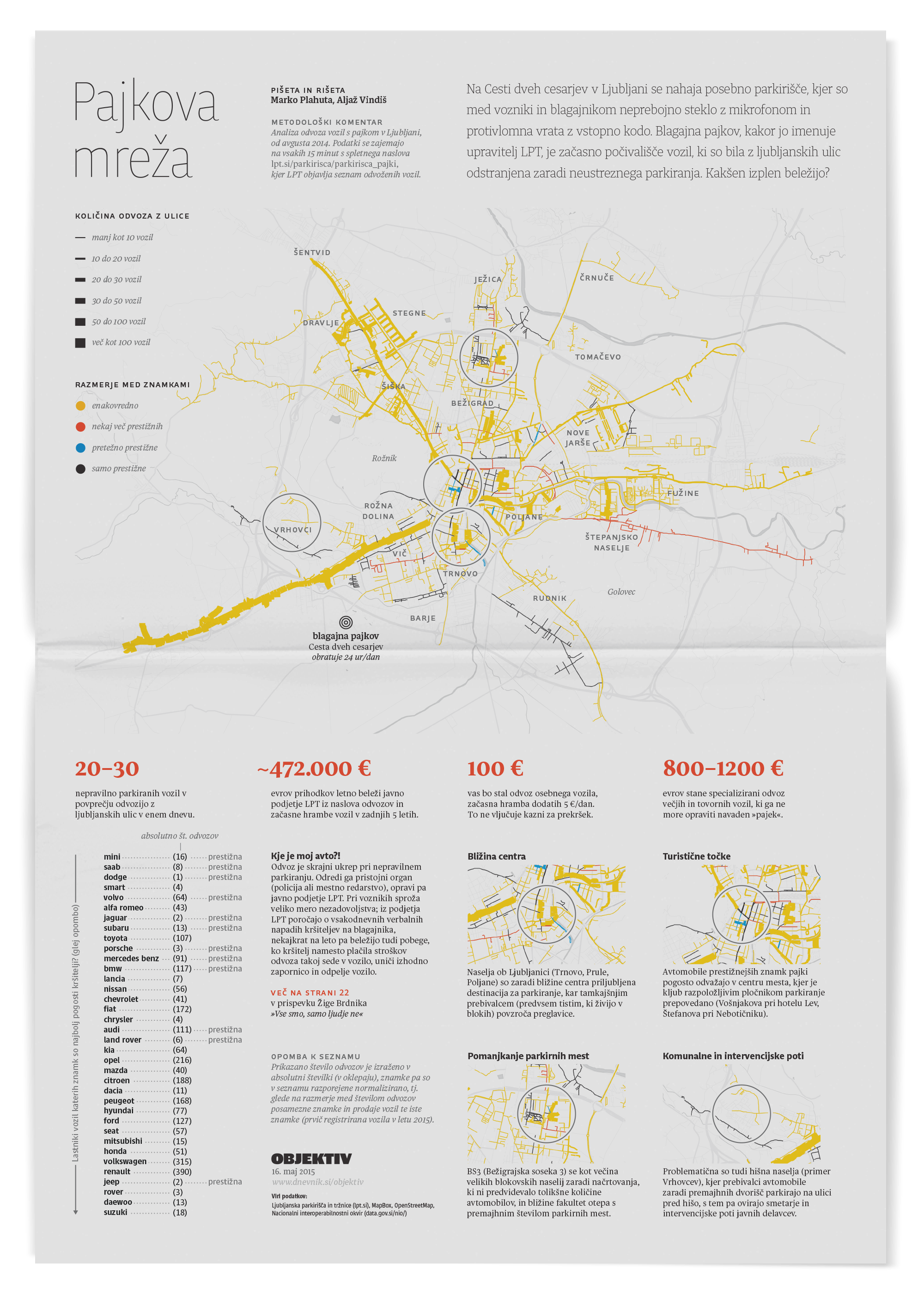
Marko Plahuta always had a trick up his sleeve. One day, he brought a year's worth of data on toed cars in Ljubljana, scraped from the municipal service website. We turned it into one of the most well-received graphics and won the Best map in show at Malofiej for it.
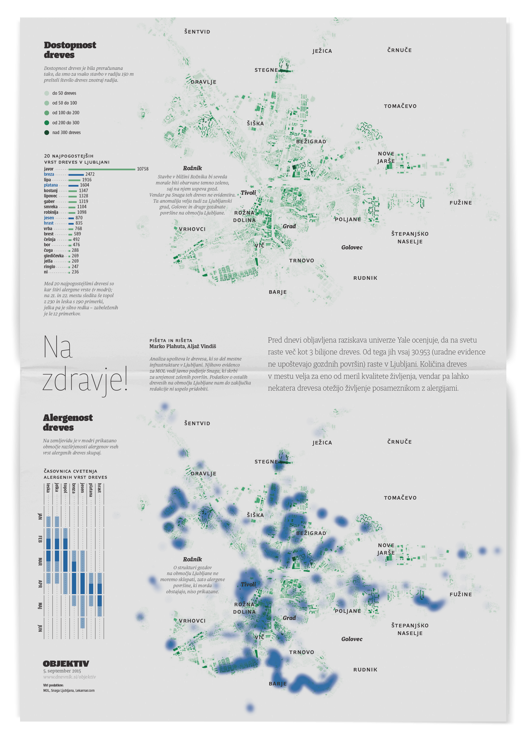
It's incredible what data you get from local experts. Marko once learned that the botanical service of Ljubljana has data on every tree in the city. We geolocated them on a map and even projected the spread of their allergens over the neighborhoods.
First signs of potential
The section quickly caught public interest, and it only grew from there. Nothing of this scale, regularity, and craftsmanship existed before in Slovenia. Feedback was steadily coming in from within the newsroom and our readers. As the weeks and months progressed, so did our work. We started sketching with actual data and learned now to present a narrative, not just raw facts. Our layouts improved, and details increased. We were working at an exhausting pace, but having such a tight feedback loop paid off. Finally, about a year into the project, I submitted our work to Malofiej, the international infographic conference, for the first time. “Let’s see what the masters think.” We got a silver medal. We were left speechless.
Objektiv reserved its entire last page, a prestigious space of any newspaper, for section Objektivno. In it, the authors demonstrated journalism that excelled both in statistical and design criteria.
With time, I have realised that there is no topic that this team could not present visually, in an effective manner.
Objektivno has been a notable addition to Slovene journalism.
Creating a world-class team
The success of section Objektivno gave Samo, the design director, leverage to pitch for heavier investment in our work. He got it. Over the following few years, we scaled our graphics desk to multiple dedicated authors: Ajda Bevc joined in 2013, Aljaž Vesel in 2014, and Marko Plahuta in 2015. The growth came with a different set of challenges: in addition to my work so far, I had to mentor the new authors. As part of the deal with the newsroom, we also took over daily graphics production. We became a full-fledged desk. Our yearly output ran in the hundreds at the peak.
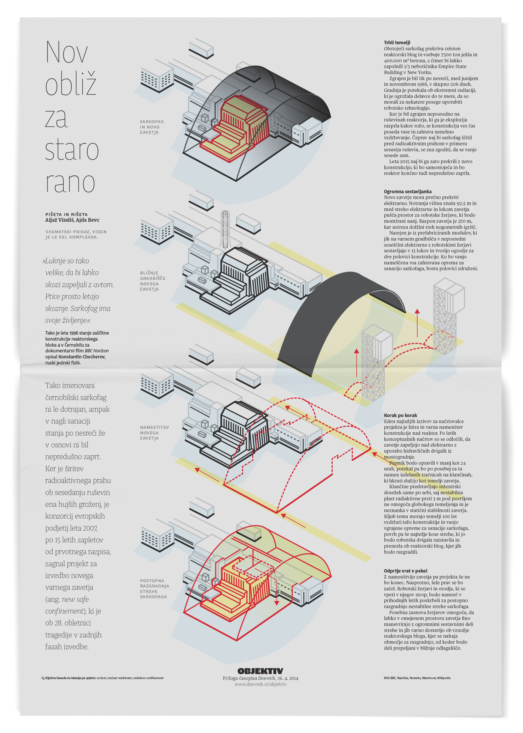
Installation of new sarcophagus on the Chernobil nuclear power plant.
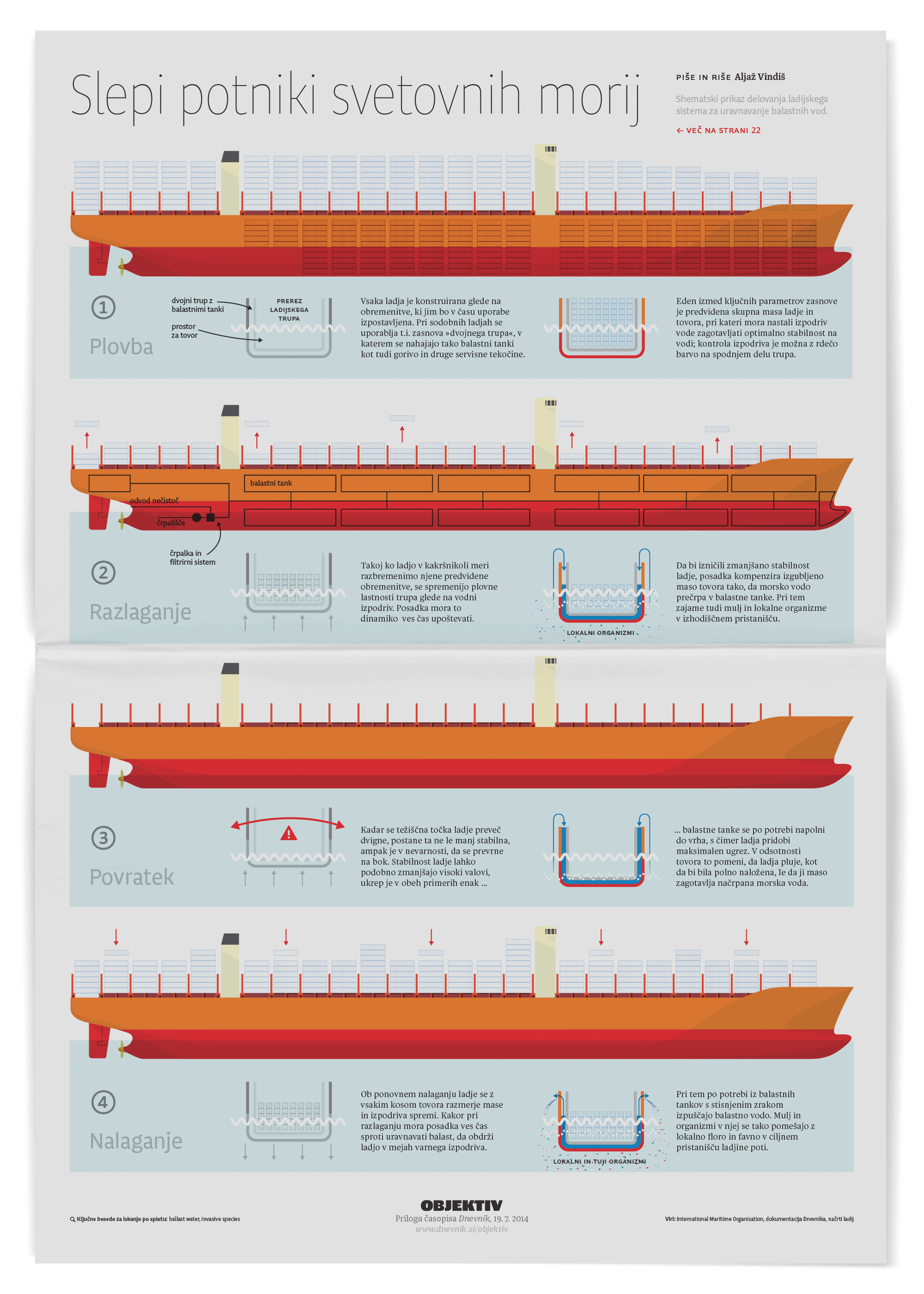
Ballast water dropped by transoceanic ships in harbour is polluting our local seas.
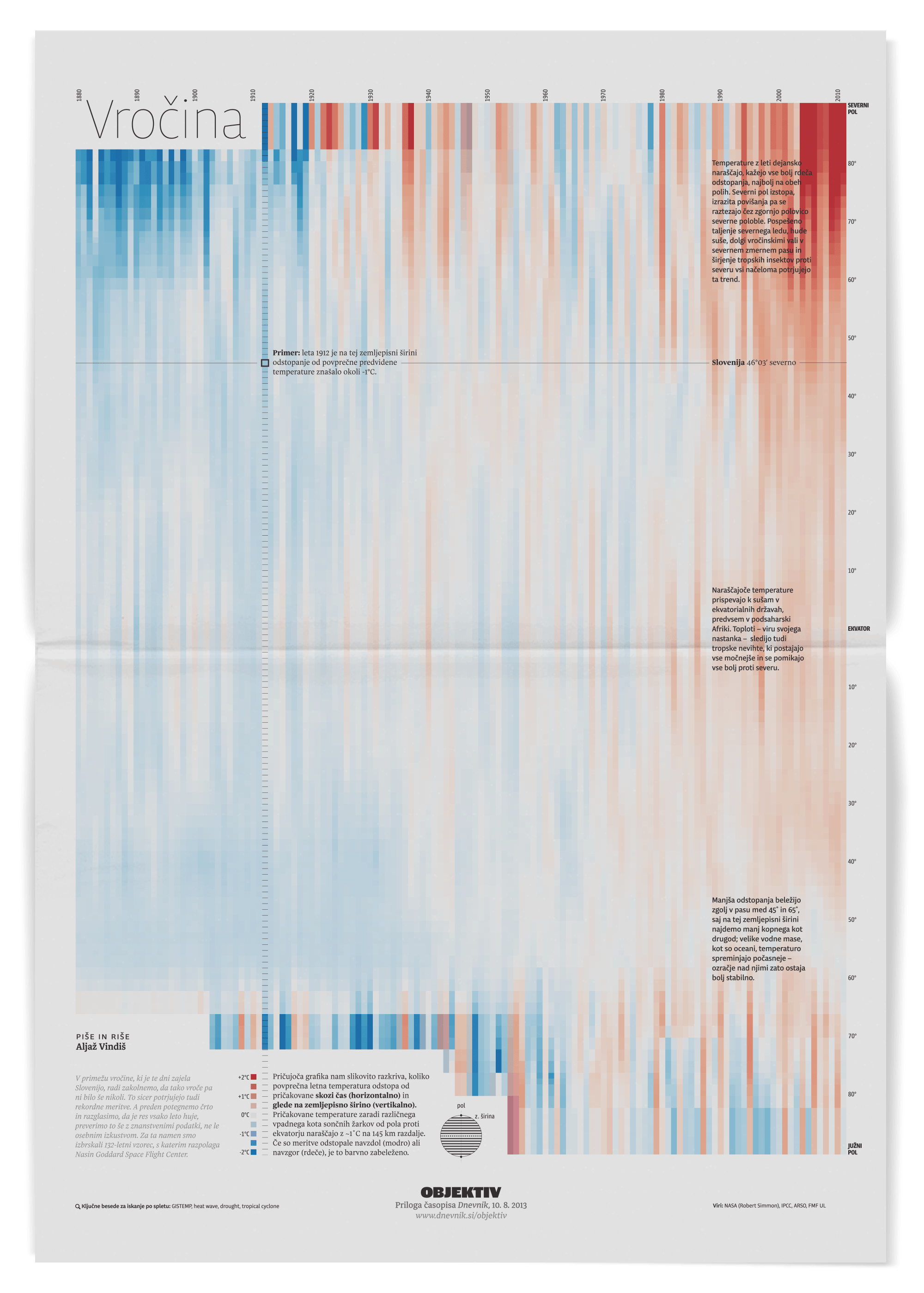
Mapping the increasing heat of Earth's atmosphere with 100+ years of data.
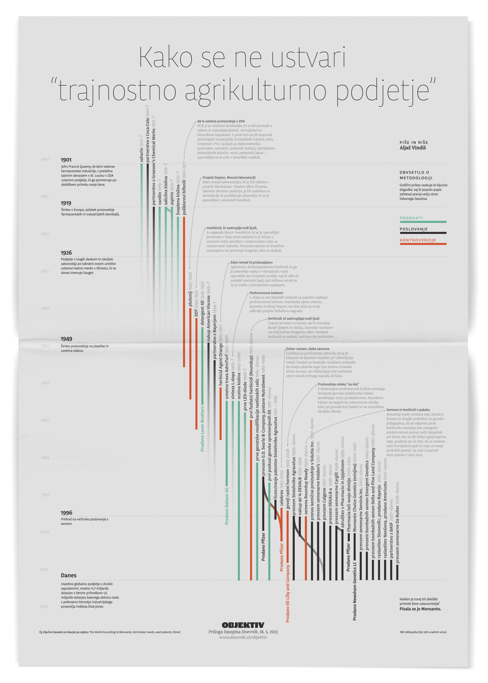
Exposing products, M&As and controversies related to Monsanto, through time.
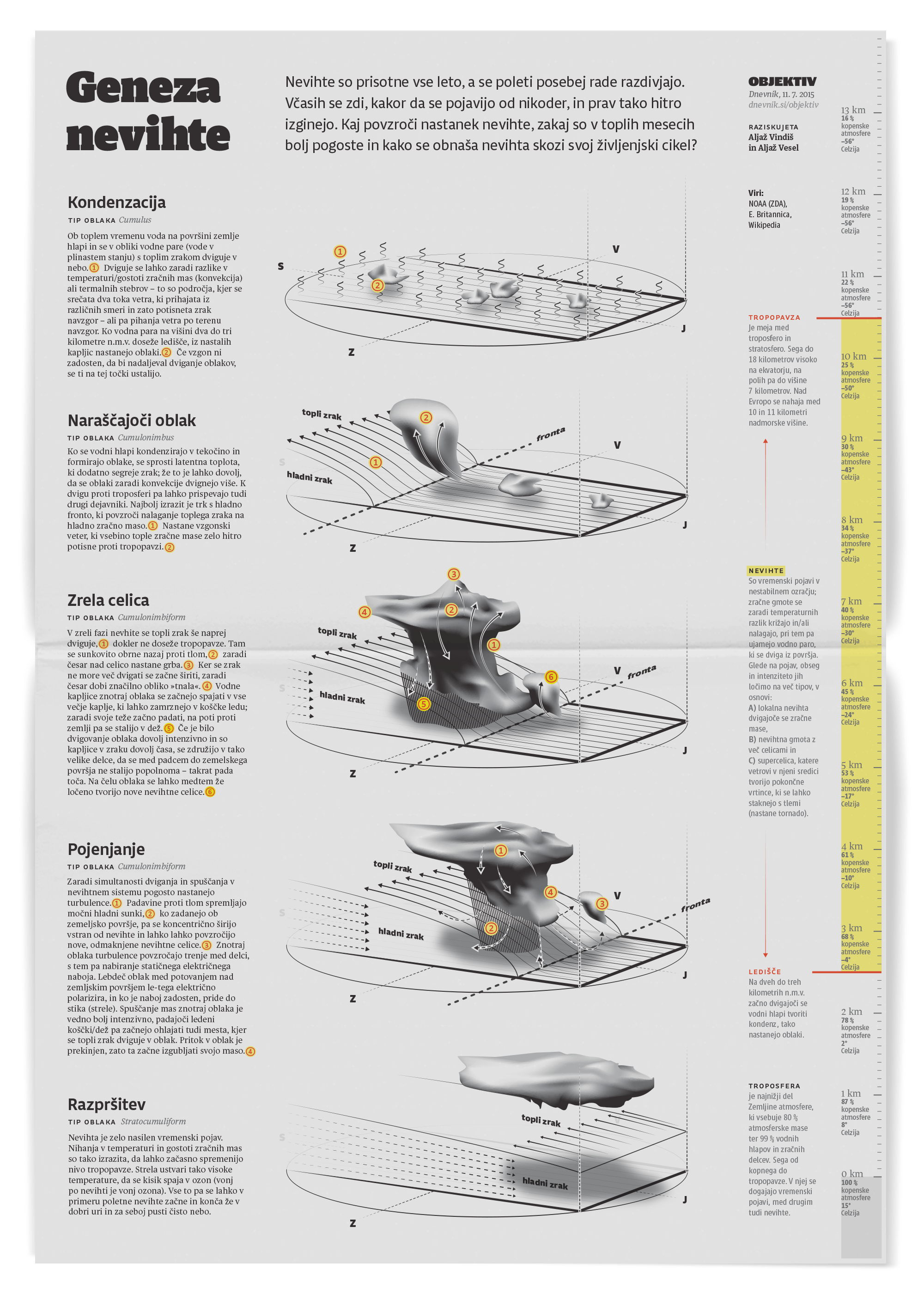
Storms are incredibly complex phenomena; we attempted to at least explain the basics.
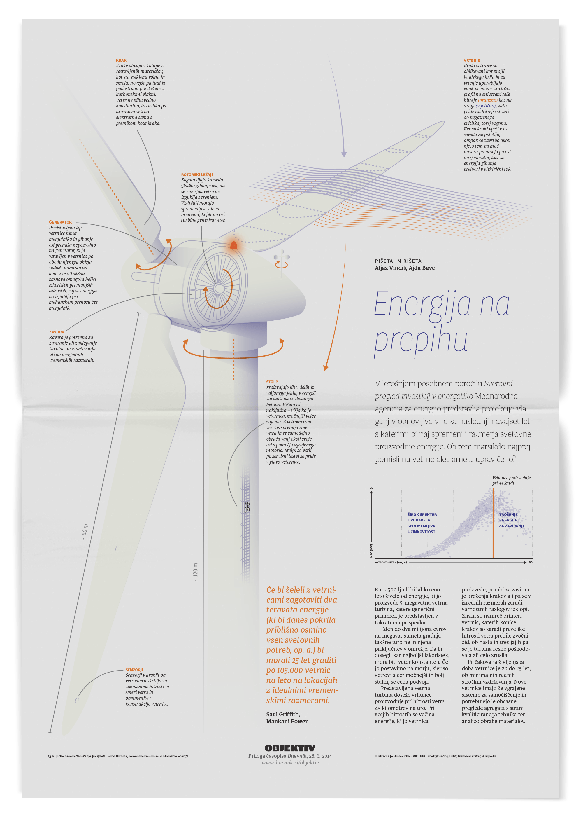
The fascinating mechanics of a wind turbine, and their optimal performance window.
Working smarter, not harder
We developed multiple coping tactics to keep ourselves honest and sane. For section Objektivno, we tried having numerous topics on the roadmap and produced some in successive series. We would work on the whole piece at once, in passes, so that you could go to print even at lover fidelity of work. We learned how to divide a graphic between us to parallelize production. We established internal standards for quality control. Over the years, we also significantly improved our integration with the rest of the newsroom. It boosted the morale of everyone involved. Towards the end, we even piloted a centralized platform for archiving and analyzing of data that our investigative journalists were uncovering.
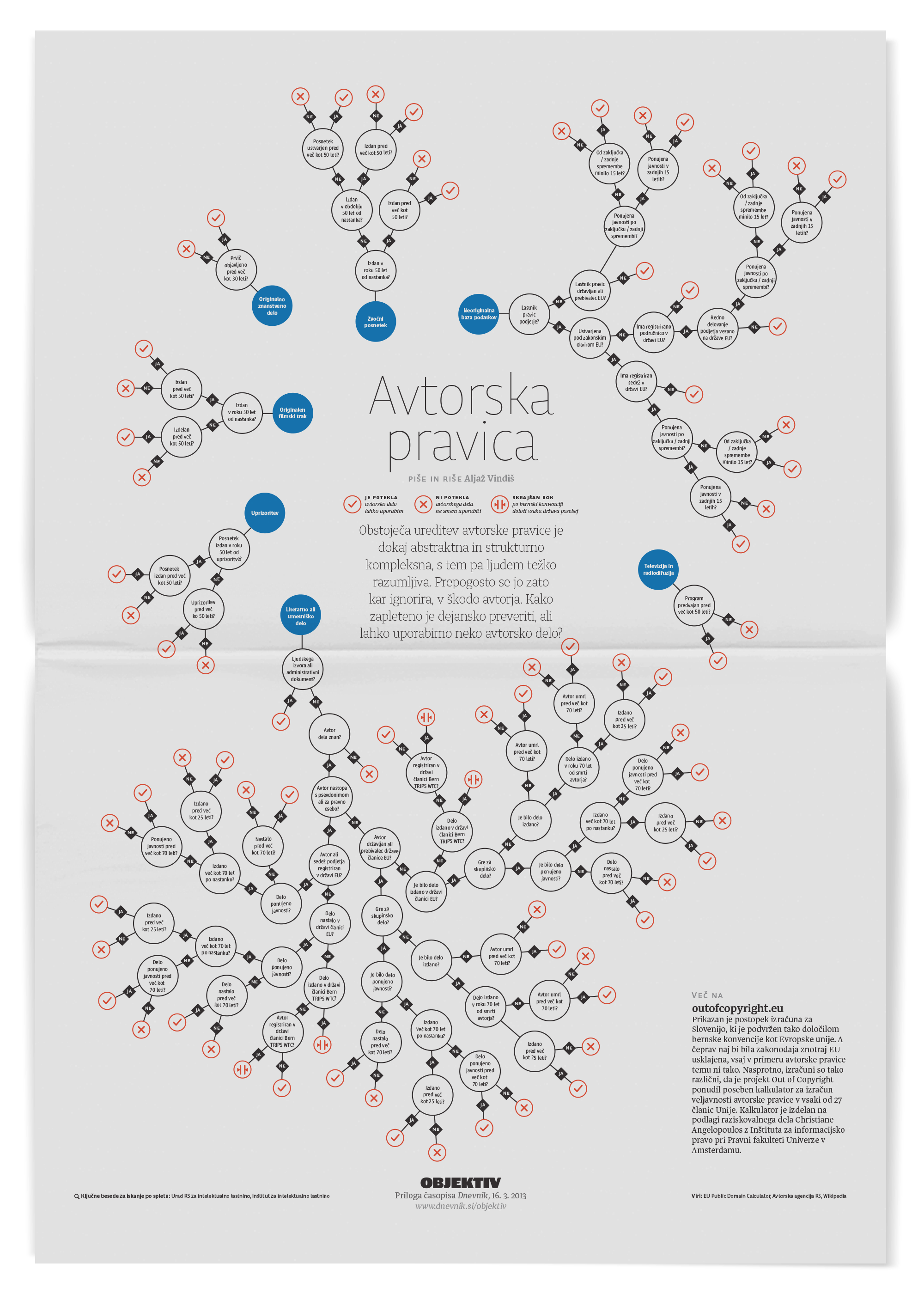
We turned Slovene copyright law into a visual algorithm that anyone could use. Some creative professionals told us they posted this on their walls for reference. It almost didn't happen: my computer crashed two hours before print.
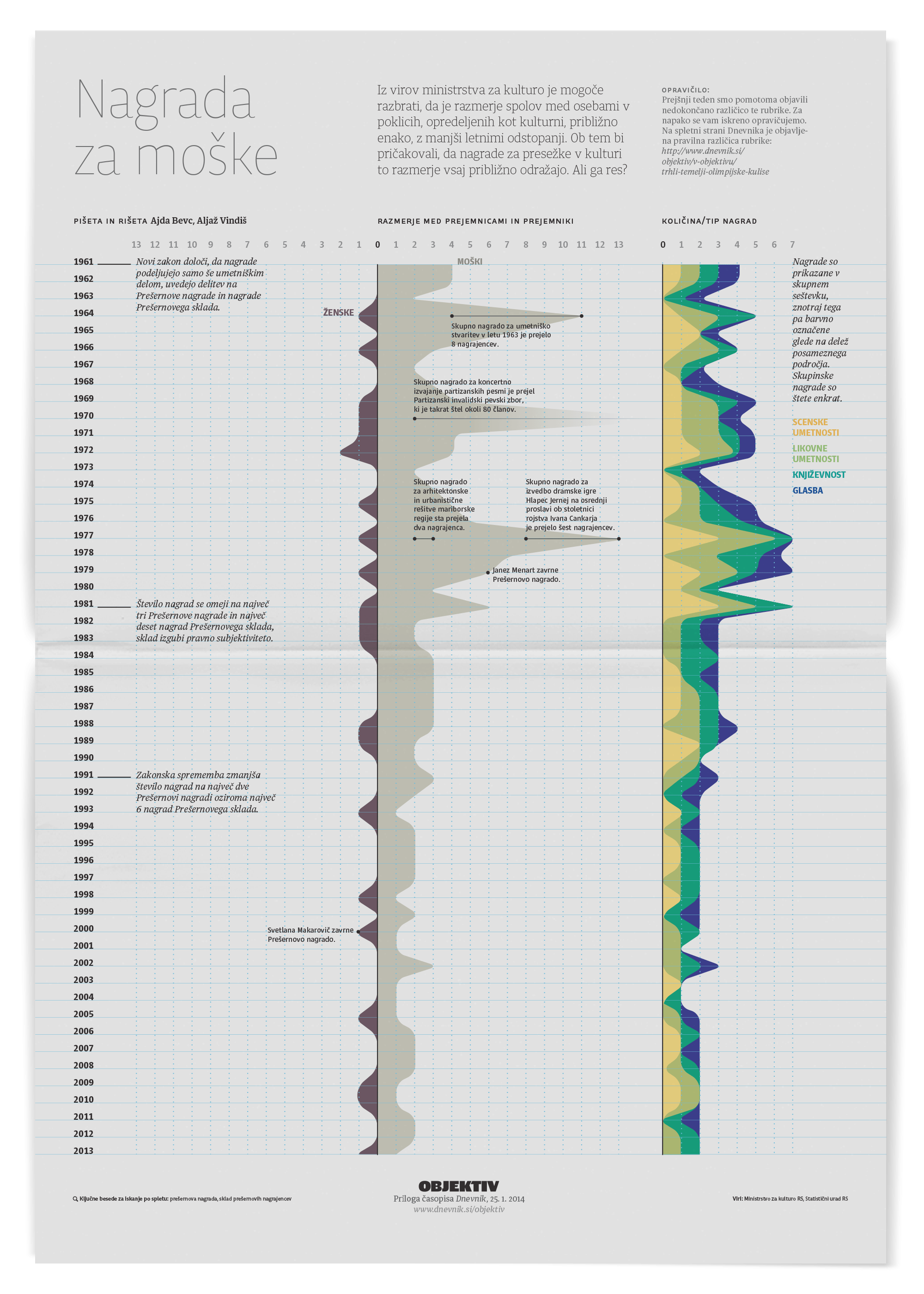
Data can be extremely revealing. When presenting recipients of the highest awards for cultural achievements in Slovenia, we saw an outsized bias towards male authors, especially in the Yugoslavian times.
The lasting impression
All-in-all, section Objektivno ran uninterrupted for four years, ending with over 200 full-page features, a strong readership, and multiple statistics, journalism, and design recognitions. That includes a Miguel Urabayen award for the best map in the show at Malofiej 24. The section paved the way for extensive graphic features in the daily paper and motivated an overall graphics increase in Dnevnik's reporting. We contributed to several breaking stories at the paper, and our work has often been integral in making the scoop even more impactful. To this day, Objektivno continues to be the only periodical project of its kind in the region. It has been instrumental in establishing visual and data journalism in Slovenia. close
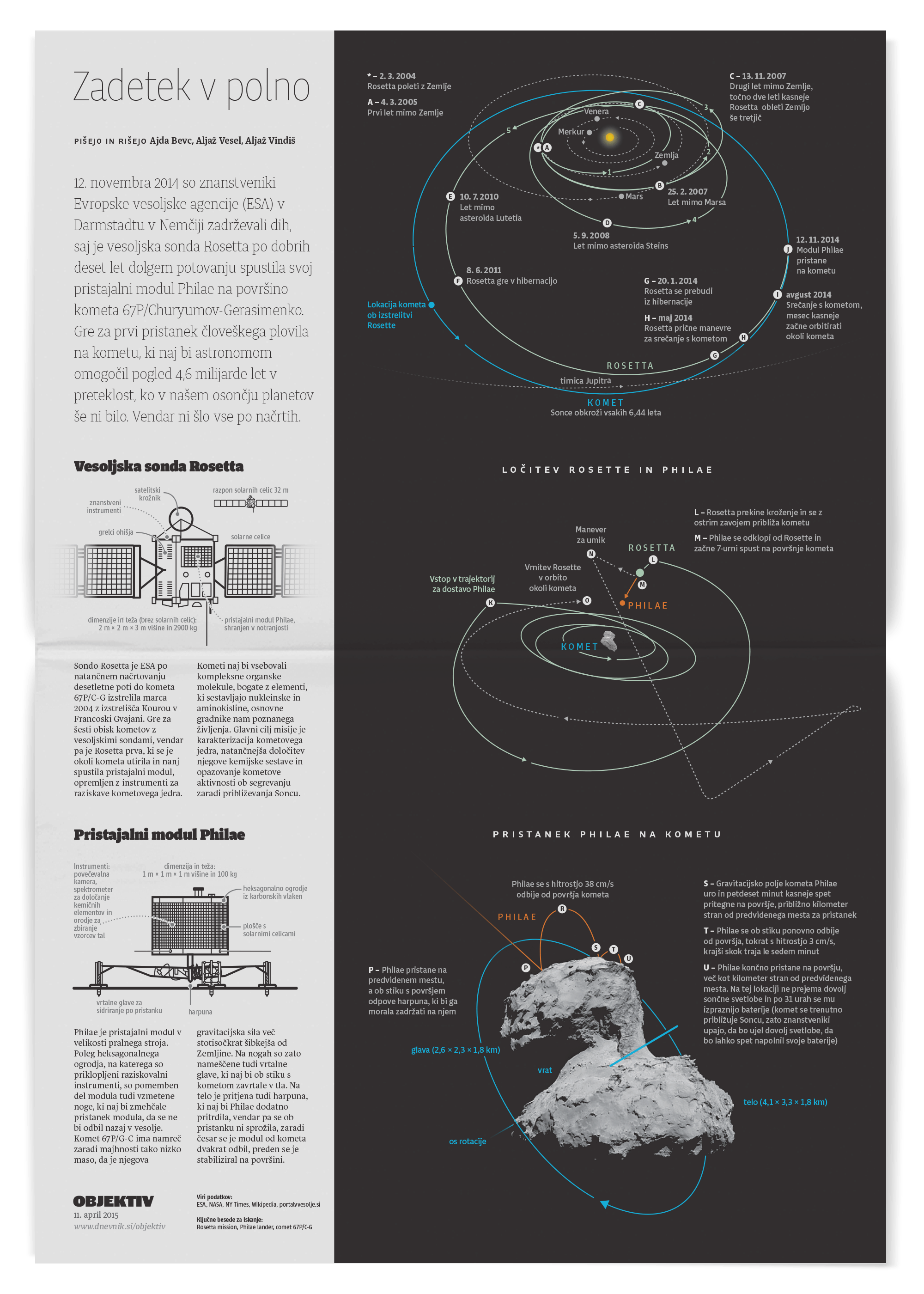
An attempt to visualise the dramatic landing of the Rosetta mission's probe on top of a comet.
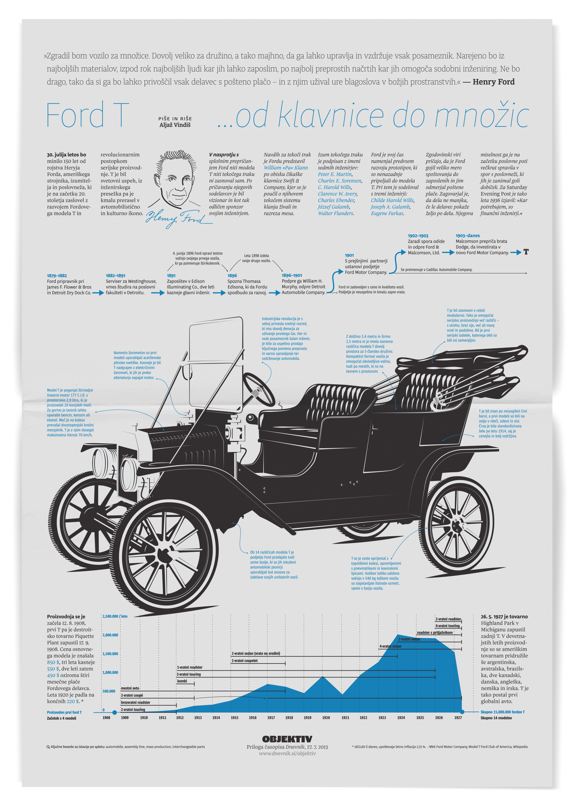
How the Ford model T came to be, for the 150th aniversary of Henry Ford's birth.
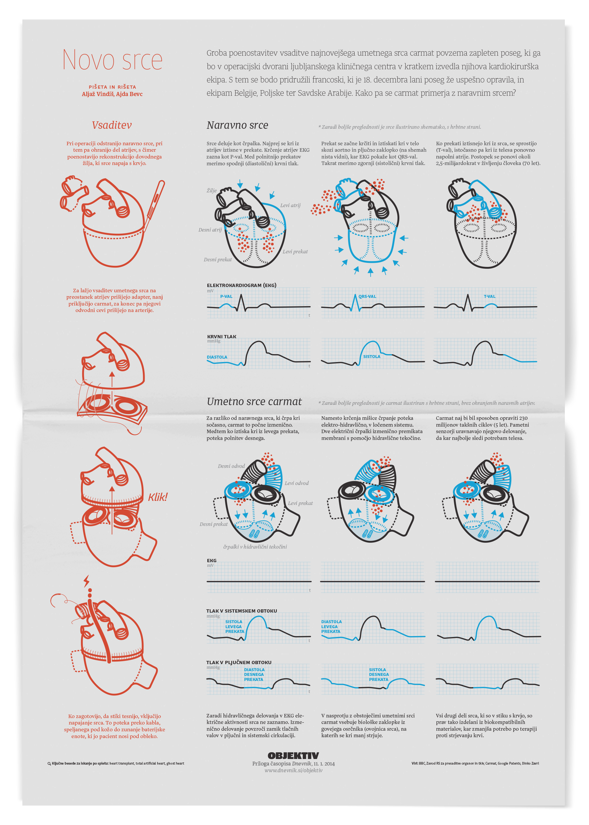
We collaborated with a cardiologist to make this piece on artificial heart medically correct.
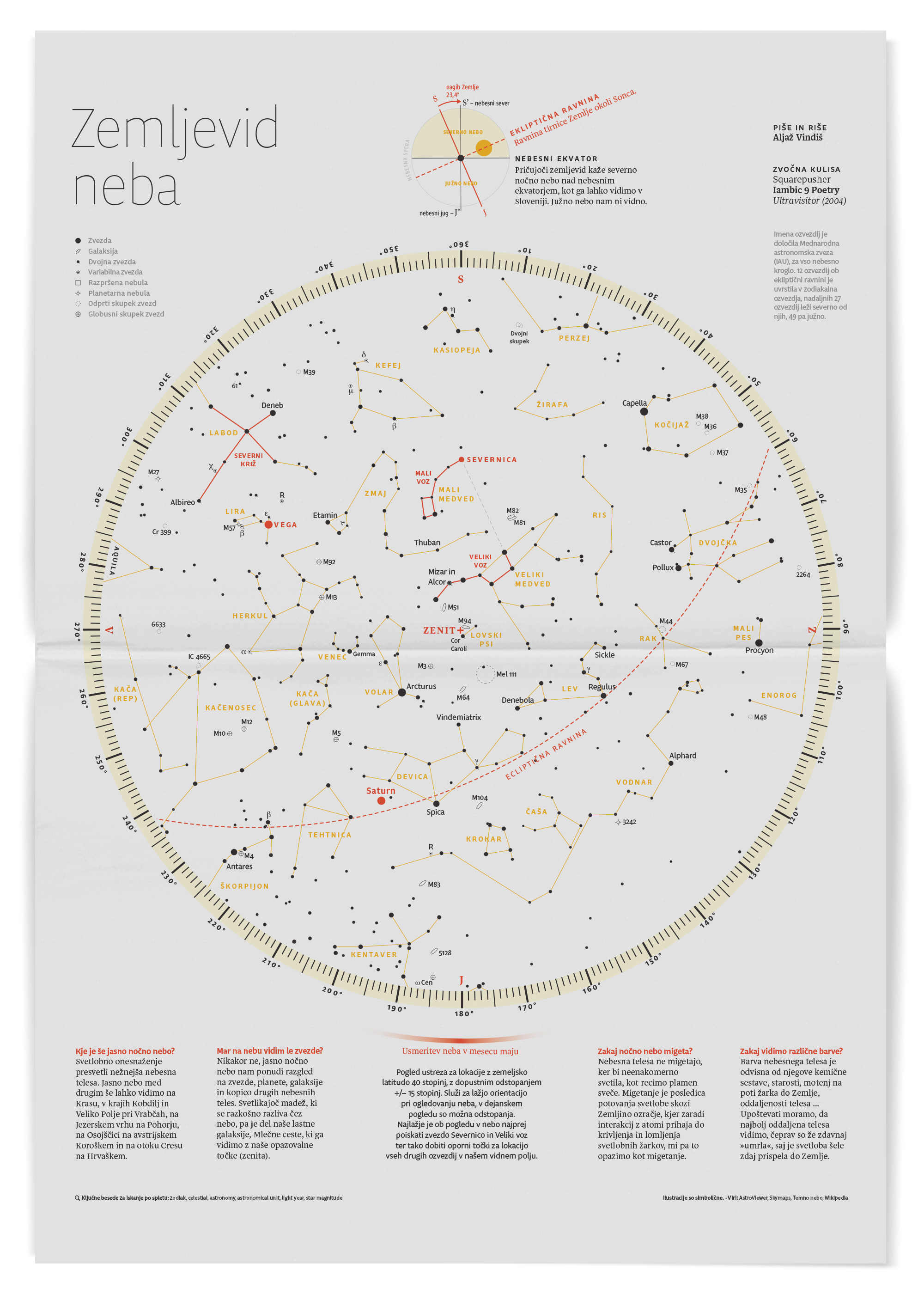
Giving our readers a guide to the night sky, as seen from Slovenia at the time.
