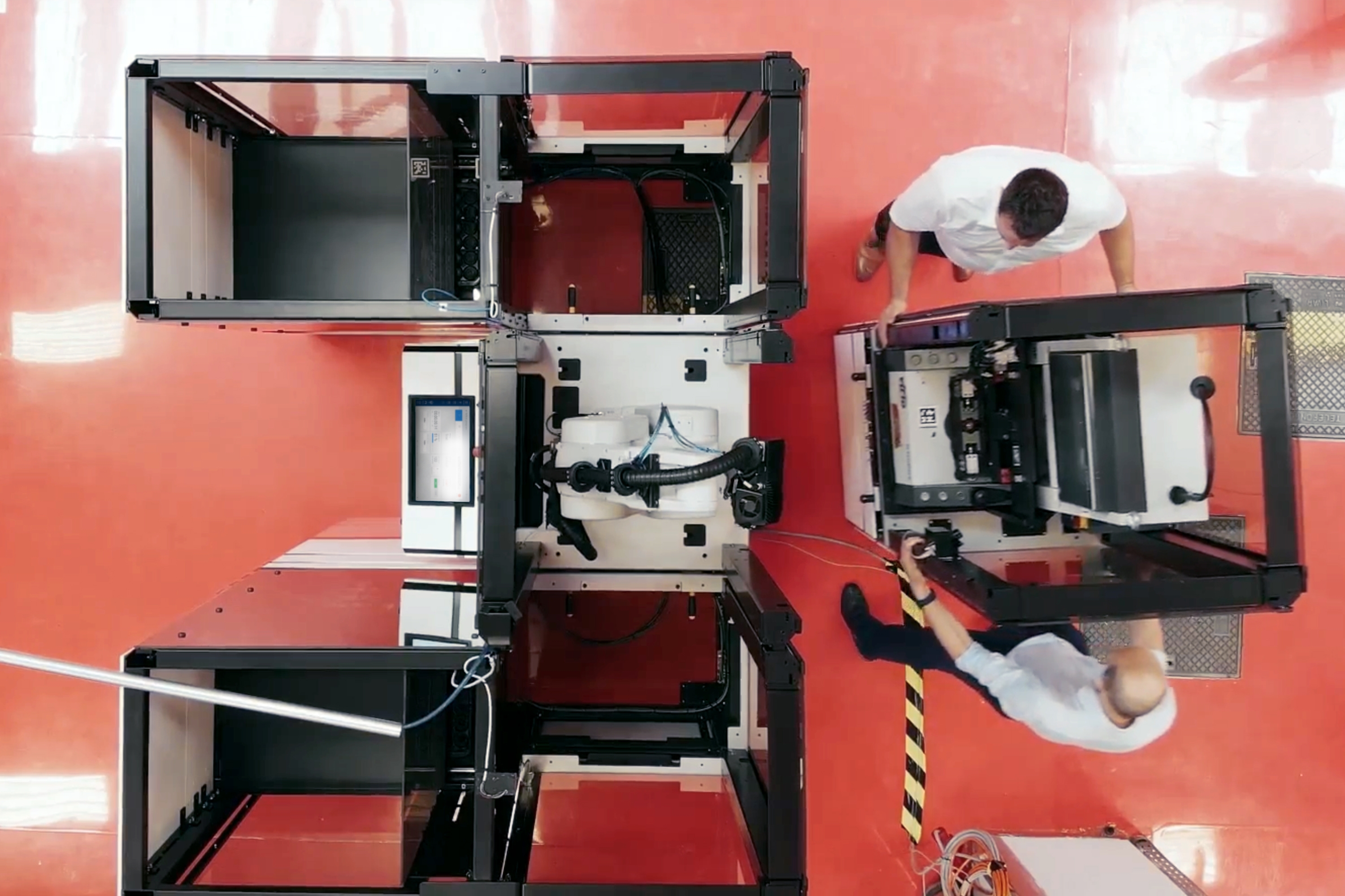
Finding the way to scalability
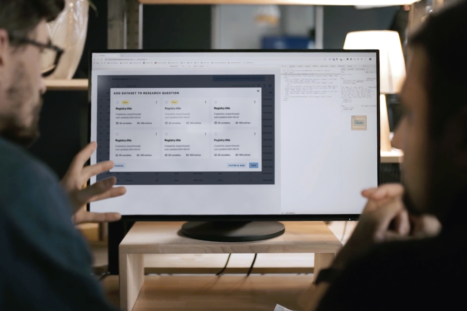
How a Slovenian company at the bleeding edge of cloud solutions is using a homebrewed design system to scale-up sales, customer deployments, and internal tools.
By pitching a business case
Design system is essentialy an internal product, and needs investing into. Developing key performance indicators and defining value propositions was key to getting the initiative off the ground.
By messiness in early stages
Debates weighing details vs. performance, user experience vs. developer experience, personal ambition vs. business reality are inevitable on every system build.
By being considerate
You can build the coolest system in the world, but if it's not compatible with existing solutions and workflows, its adoption will suffer. Transition periods are a fact of life.
By dedicating resources
Working on yourself is always the hardest. Urgent matters get priority over long-term initiatives. Keeping the team together and focused has been crucial.
By striking a balance
Unique, rich visual language will make products stand out. But it can come at the cost of technical performance. It takes mature, open-minded designers and developers to deliver both.
By inclusive scoping
Solving all problems a product team may face is cost-prohibitive. Mandating the use of an overly limiting system is counter-productive. It is crucial to involve users in decision-making.
The whole story
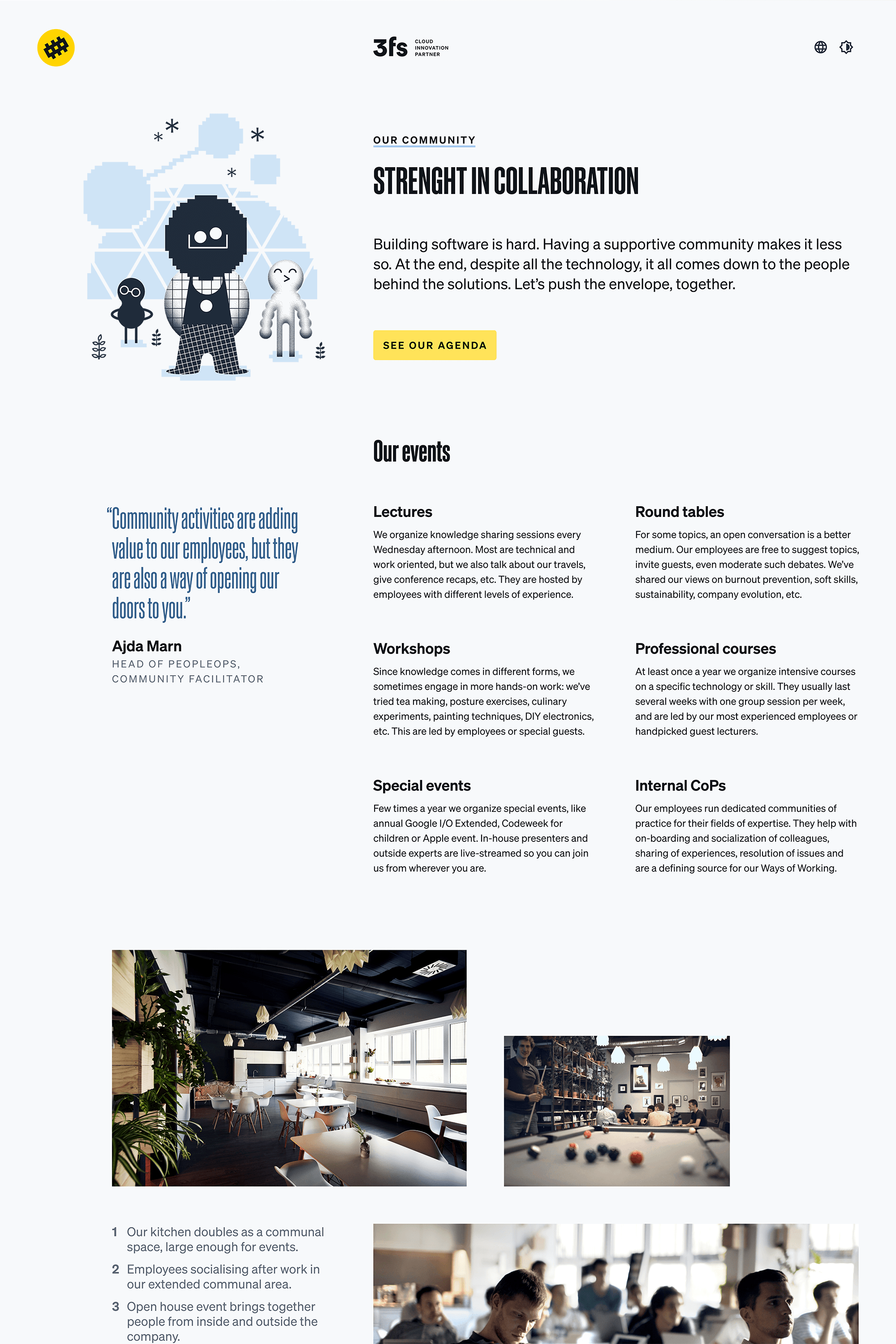
Wayfinder in use for the marketing website.
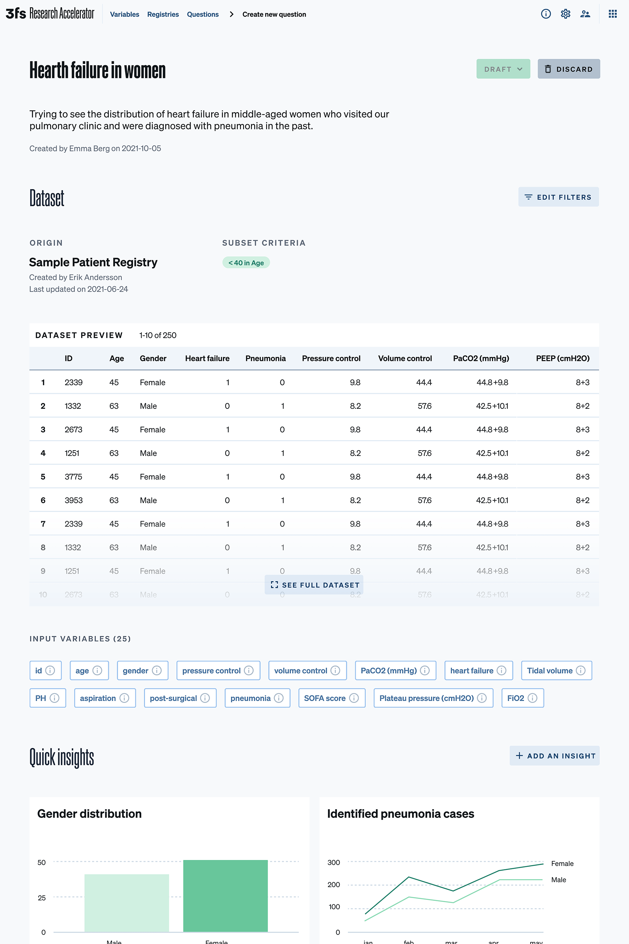
Wayfinder in use for a data-driven webapp.
The gist of it
3fs is a highly dynamic, innovative environment. Multiple initiatives are in the pipeline at any time: 3fs marketing assets, numerous internal tools, research & sales prototypes, several client projects, etc. As a result, it is hard to keep designs consistent and code clean. Back then, prototyping has also not been as cost-effective as it could be.
One could hire more people to compensate, only to see issues appear in other areas. Instead, our internal projection clarified that huge savings quickly offset the up-front cost to develop a design system in time and resources down the line. It finally convinced our CEO to greenlight the initiative, and Wayfinder (the system's eventual name) was born.
in realistic savings on resources needed to prototype & launch each new product.
days to create the first ever demo of a high-fidelity prototype with our components.
people to kick-start the initiative, and deliver the minimal viable design system.
months to design and build the beta launch, ready for testing and refinement in real use.
Doing the homework
We first inventoried our existing software, analyzed sales and production workflows, surveyed our staff for tooling preferences, and talked to our IT operations team about the optimal approach to collaboration and distribution. These insights were vital for informed architectural decisions down the line, making the first build more cost-effective and accelerating Wayfinder's initial adoption.
3fs has also been amid a rebranding initiative that introduced a unique verbal and visual language. This prior work would simplify the graphic design of the system to a degree. However, expanding into the product development domain turned out to require a non-trivial amount of work.
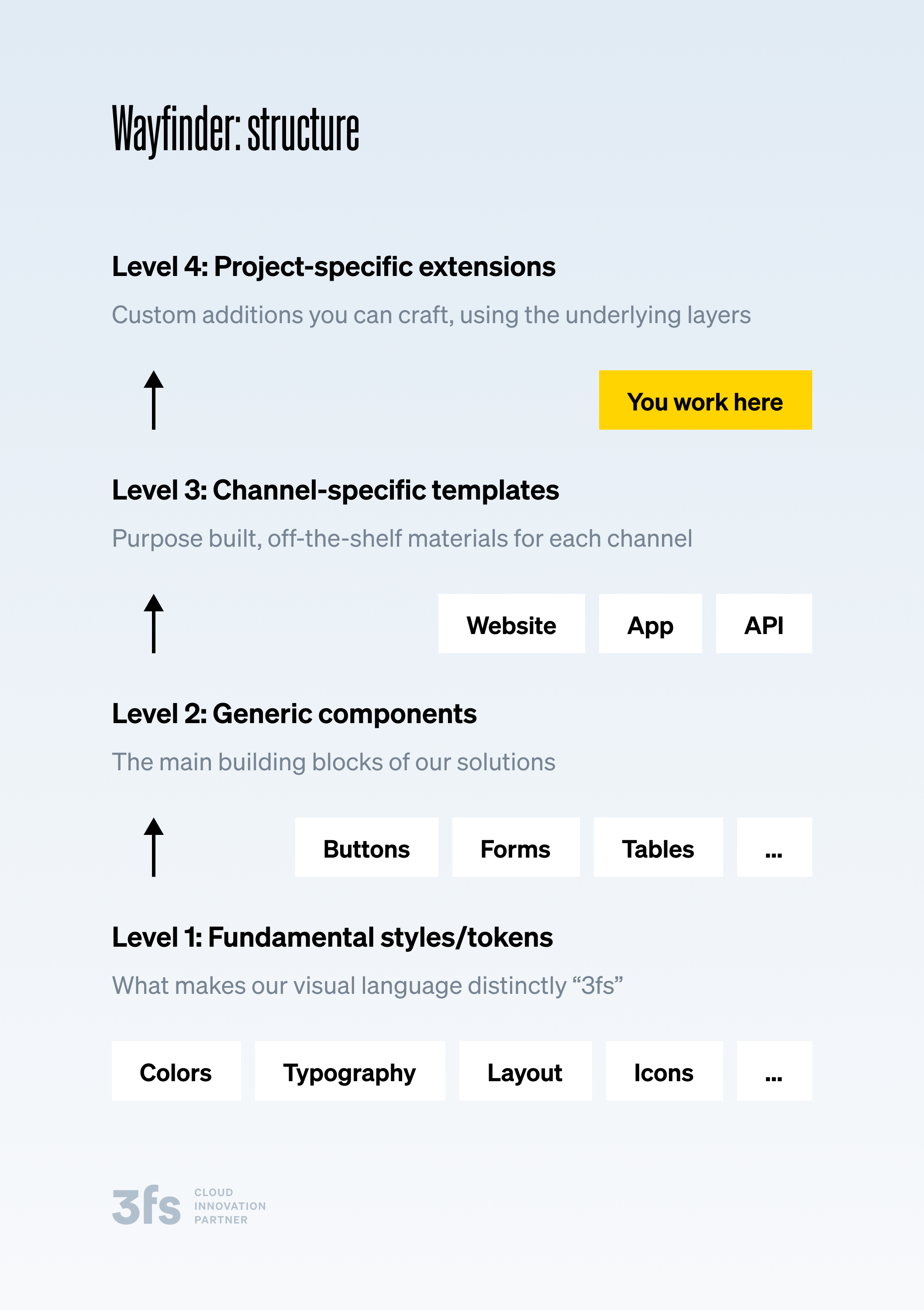
Structure explainer for 3fs employees.
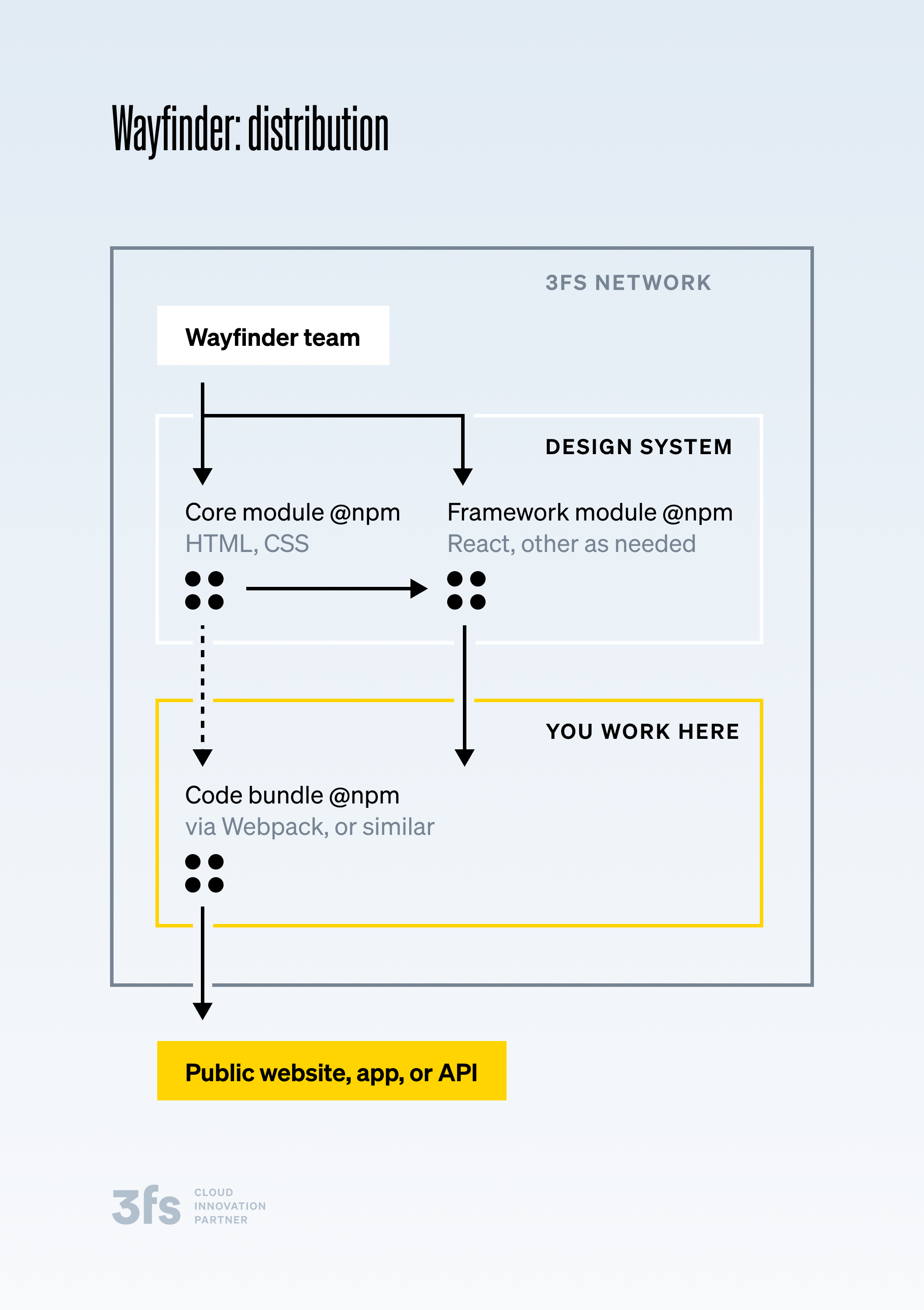
Distribution explainer for 3fs employees.
Setting the foundations
Matej Žvan, the Wayfinder engineer, and Jurka Mihelin, the Wayfinder designer, worked closely to ensure Wayfinder's foundations – grid, spacers, typography, colors, icons, and pictograms – were done in an accessible, future-proof way. A lot is at stake, after all. Every higher-level component will be affected, and subsequently all of their users. It took considerable time and multiple iterations to get the foundations right, at times frustrating the team. But it was all forgotten when our later work showed it was a worthwhile effort.
When doing our “homework,” we gained a lot of valuable insights on the component scope for the MVP release of Wayfinder. Teams welcomed the idea that we make default choices, especially if they are smart solutions to common use cases. They still wanted to adjust the components, but endless choices were seen as an anti-pattern. Utility functions like input validation in form fields were also noted as productivity boosters.
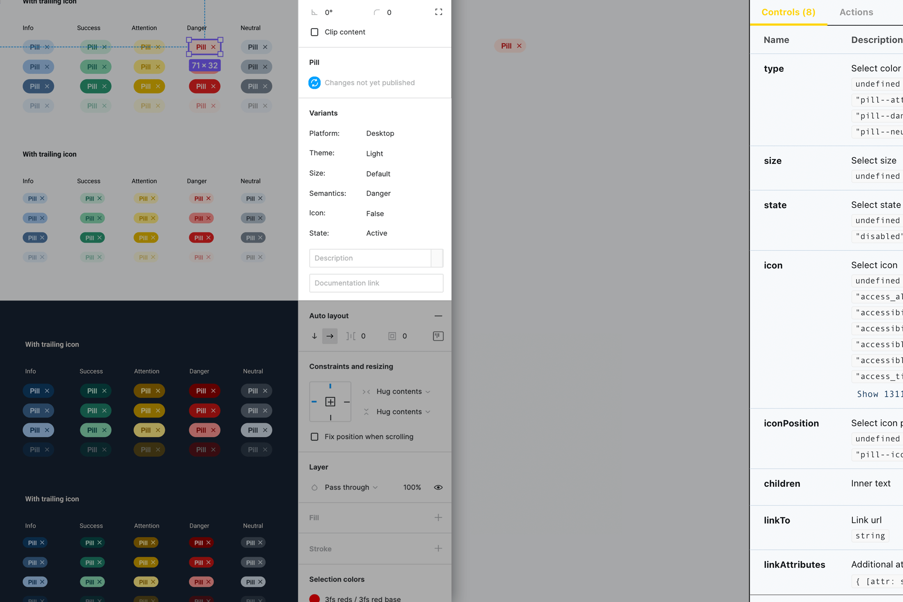
Designers' tools (left, Figma) finally catch up to engineers' output (right, Storybook). We were thus able to create data-driven, variable components in Wayfinder that are 1:1 equal for both disciplines.
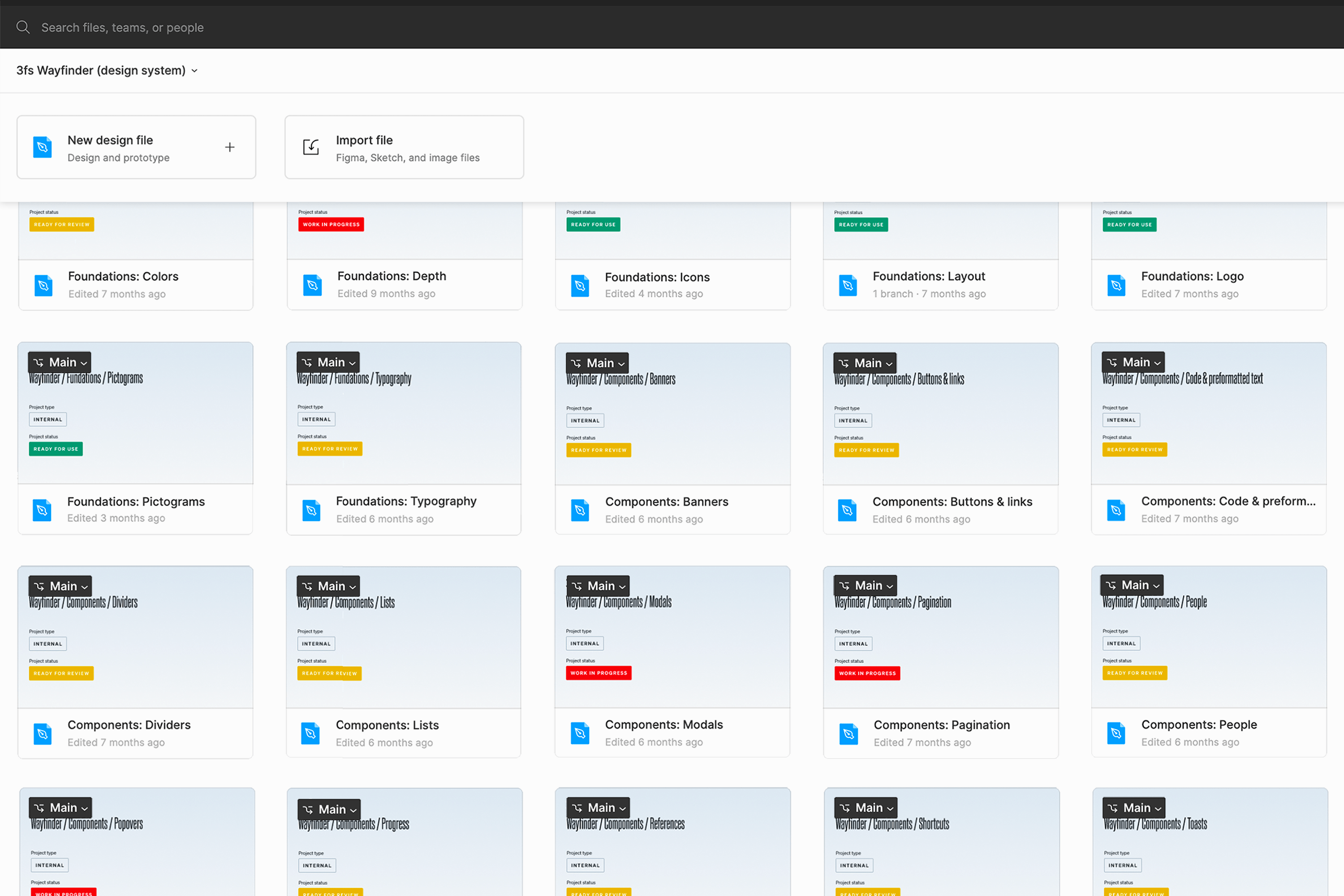
We organized design files and code base into a matching file structure and release numbering. It made the system browsable, shareable & traceable per asset, in both domains.

Having a single source of truth in Zeroheight documentation tool, with both sets of assets using the same underlying logic, drastically improved team communication and collaboration.
The challenge of data
3fs specializes in complex, professional, cloud-based software: enablement services in the telecommunications sector, IoT platforms for medical environments, research tools for large data sets, and similar. They come with special UX considerations, particularly in presentation and interaction with data. One of the main value propositions from the design system team has been to simplify and improve that.
We worked with studio AA, responsible for 3fs branding, to expand it with tailored data visualization guidelines. But implementing them as reusable, programmatic components is a much larger, more complex task. So we took the pragmatic, demand-driven approach: adding components as needed, and only for cases that show up repeatedly in 3fs teams' custom implementations.
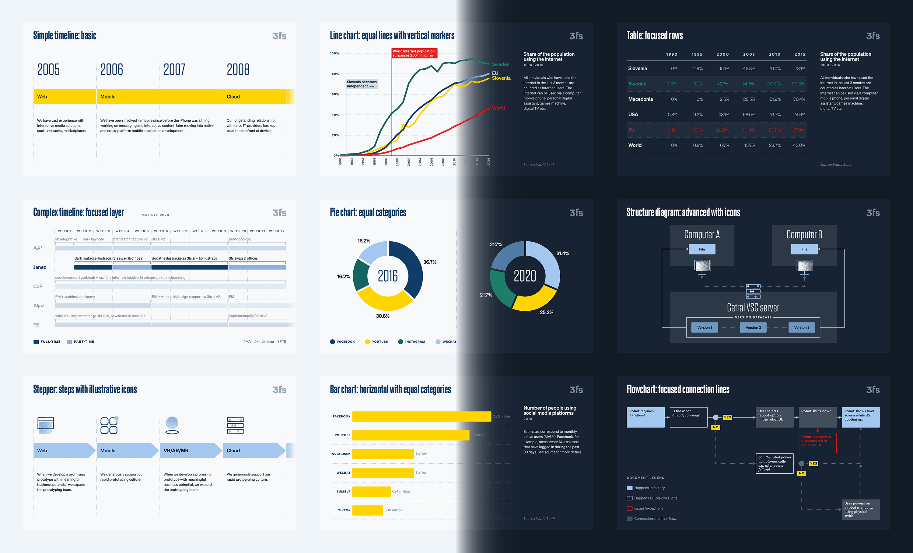
3fs data visualisation and infographics language begun as a limited exploration by studio AA, but then got ported to the digital product domain and greatly expanded. Both the light and the dark theme were considered.
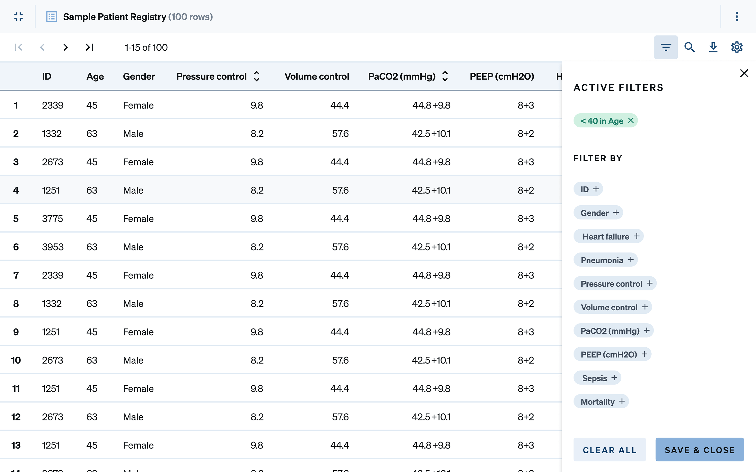
The good ol' workshorse: the data table. We put a lot of thought into making them pleasant to the eye and easy to use, since so much human-data interaction is done throught them.
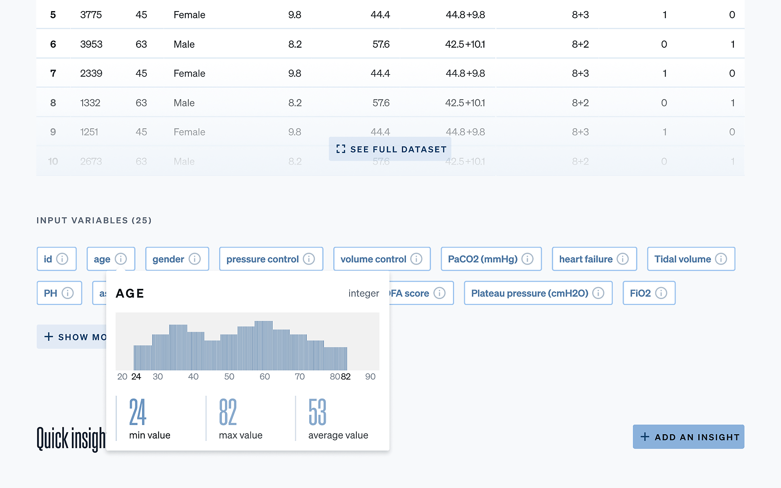
Exploratory interaction with data is often neglected. We enabled data transparency and serendipity with pop-up visualisation pattern, featured in Wayfinder's guidelines.
An educational experience
We did consider repurposing another design system in the beginning. But, in addition to giving us full ownership, a complete internal build presented an invaluable educational opportunity. We often encountered design systems at our clients in various stages of maturity. Having our own inner “playground” helps 3fs acquire a more profound knowledge of intricacies that come with building and maintaining a design system for digital products, thus offering a better service to our clients. close
Design systems substantially reduce the scope and complexity of UI work on individual products. But UX work cannot be streamlined like that: the challenges it solves are unique to each use case, rather than systemic.
